I felt as if I had this particular class half as much as my other classes. Perhaps this was because of the snow days and the scheduling but I still felt as if something was missing. I also wish I could have had more time in the lab. With media I feel as if applying what you learn is more important than reading from a textbook. The lab portions of the class were something I looked forward to but still the labs ended quicker then they began.
Although I am happy the class covered a variety of topics I still felt as if certain lessons fell short in some areas. We only really had time to learn one topic a week. The labs did their best to apply the topics but I feel that it may have been too much information crammed in too little of time. The midterm for example left me feeling misguided and overwhelmed.
However, the concepts sheets were really useful. If anything, the concept sheets did their best to bridge the gap between all of the information being tossed around during each lecture. Still, it would have helped if the concept sheets were reviewed in lab. Unfortunately, there really was no time to permit anything other than what we did in lab.
My favorite lesson was Photoshop, primarily because I already had a basic understanding of the topic. The assignment for me was simple yet had the potential to be challenging. The stamp project was a good project for beginners and experts alike. While I choose to remain simplistic in my design, I saw room for expanding and experimenting in the future.
I overall really liked the class. Yet, as much as I enjoyed the class I still do not feel as if my effort showed during class. Media turned out to be tougher then expected, despite my overall effort. Still, I loved the idea of the class. Do I feel as if the class has room for improvement? Yes. But media is still evolving and growing today; therefore I believe that as long as this class is being taught at hunter there will be need for improvement and growth.
Sunday, May 23, 2010
Extra Credit- La Lupe

I recently went to the MoMa to watch La Lupe: Queen of Latin Soul; this is a documentary profiling the career of the famous Cuban singer La Lupe. The film takes place in the 1960’s and is primarily in black and white. Since La Lupe primarily sang in Spanish, there are English subtitles in white Helvetica type.
The film was very enjoyable going over the span of Lupe Yoli’s life from domestic abuse, singer, to religious speaker.
The documentary features interviews throughout with people in close relation to La Lupe such as her producer. In these shots the filmmaker chose to use medium close-ups. The use of a medium close up was a strong decision because the shot establishes a location; for example, the producer was set in front of a studio. It allows the audience to connect who the person is to where they are. Sometimes in documentaries people may forget all of the people being introduced. In the film, many pictures are shown as the people are being interviewed. This was a good tactic because the audience will not get bored just watching a person talk for minutes at a time. I loved the use of interview narrations because it allowed audiences to feel closer to Lupe. The movie is an oral history similar to what you find on E!’s Behind the Music.
The film starts with the funeral of La Lupe and backtracks to cover the span of her celebrity. The documentary takes place decades ago but remains present. La Lupe was an innovator and truly ahead of her time.
Sunday, May 9, 2010
Design I like- Stride Gum takes over El Toro

Within the past couple of years the digital age has truly been booming. It has been impossible to avert your eyes from advertisements no matter where you go. Recently I found an advertisement in one of the most unlikely places, a rollercoaster.
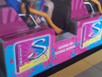
The ad was for Stride’s new flavor changing gum and it was located on El Toro in Six Flags Great Adventure in New Jersey. For those unfamiliar with Six Flags rollercoaster, El Toro is a huge wooden coaster and only a couple of years old. Many rollercoaster lovers wait for hours on the line for El Toro making it an interesting place for an ad that is bound to draw many eyes.
The advertisement’s color popped on the otherwise dull light brown colored wood cars. The pinks and blues of the ad filled every alternating car. I really liked the bright colors because they drew my eyes and left me very curious as to what the ad was trying to portray.

Stride’s new flavor changing gum is supposed to take you on a journey from a fruity to minty flavor. The tagline on the advertisement was in simple white Helvetica text stating “Going Up, Going Down,” very fitting for a rollercoaster that prides itself on hills, spirals, and speed. The simple Helvetica text was not lavish and showed that the main focus of the ad was not on the text. The main focus of the ad was that is was in an unlikely place like El Toro.
The advertisement had a graphic of the gum box. The graphic stuck to the color scheme of the rest of the rollercoaster car with bright blues and pinks but also adding a touch of yellow to add contrast to the gum package. The giant “S” on the graphic represents the logo for stride gum.
I loved the design of the new Stride advertisement. I never saw an advertisement on a rollercoaster and I could not help but think about why a company would chose a rollercoaster. Then I realized that clearly the advertisement worked because it got me thinking.
Subscribe to:
Comments (Atom)