Monday, December 13, 2010
Blog #4 - Animation
About a third of the time I spent on my animation was trial and error. I was trying to familiarize myself with the program. I never imagined making a cartoon would be so complex, time consuming, and tedious. Having a new appreciation for the art form is an understatement, animation artist are fantastic. My favorite part was seeing my vision come to life. To make the butterfly move I used two different symbols (one with the wings open and one closed) then I manually moved the picture and alternated the symbols. By not using a tween the butterfly had a more realistic and jagged approach.
The hardest part of the project was having the flower grow, I wish it would have looked a little more realistic. I had trouble with the shape tween, eventually I had to split up the flower into two parts, the result were decent, but it still looked like a ball expanding.
I have a basic understanding of Photoshop and that really helped in drawing the animation. The drawing of the animation took at least forty minutes to get perfect, I had many mishaps with the flowers.
I overall am very happy and excited to have finished my first flash project. Doing this assignment has increased my interest in the subject significantly and I one day when I have time I would like to just spend a day learning a little more about the programs capabilities.
Sunday, November 14, 2010
BLOG ENTRY #3: The Banana Chronicles
Originally, we wanted to a short film based solely ‘in the eyes of a banana.’ Filming this was difficult because continuity was always an issue (is the banana inside the bag, is the same person passing by). The end result was decent for the allotted timeframe but if it could be done again, I would want more cameras and a lot more reshoots. Another problem was definitely the tracking shots. It was very difficult to film only the banana while weaving in and out of Hunter traffic. The filming was often shaky and unsteady. If I could do that again I would try and set up tripods to increase stability, for the given timeframe this was impossible.
I am really happy about the after effects. I did not have a clear song in mind during the filming but afterward during editing, my partners and I defiantly felt an old silent film vibe. Adding the grainy film look with only a ragtime piece accompanying the footage was probably my happiest part of the project; things seemed to fall into place.
I learned a lot about continuity, planning and directing filming this short film. I never really understood why it was so important to plan out every shot until I was thrown into a crowded hall with only a banana.
Sunday, October 24, 2010
Blog 2: Editing
At around 5:38 there is a long shot of Guido in the background with a spotlight on him. The next shot is of him falling and almost seamlessly the next shot is a close-up of Guido standing up. Now the editor builds suspense in the most heartbreaking part of the film.
Guido’s little son Joshua is hidden inside a mailbox, out of sight from the Germans. Guido is aware of his son’s whereabouts and has to walk by the mailbox as the soldier leads Guido to his death. The editor builds tension by showing Guido and then showing the mailbox, this allows viewer to understand the proximity of both characters in relation to each other. The editor zooms in on a close up of the son’s eyes and then a shot of Guido looking straight ahead; this creates the illusion that they are both staring at each other. The next shot is from the perspective inside the mailbox; all the viewers can see are shadows of a rectangle and a long strip of action creating another illusion looking through the child’s eyes. By the end of the scene Guido is lead down a long path and out of sight of the viewer, gunshots are heard and then a solider emerges alone.
The scene was edited with many illusions and assumptions on the viewer’s perspective. However, nothing felt force and the editor kept the entire scene very suspenseful and heart wrenching. The editing was flawless and without carefully reviewing the scene it would feel as if it really was the view inside of a mailbox and Guido and his son where staring emotionally at each other.
I started my analysis at 5:15 in the video.
Sunday, September 12, 2010
Blog 1: What I hear
There is some rhythm in the streets. You can hear it from the sidewalks. You can feel the pulse from an incoming train. You can see it from the parks. Manhattan is home to its own relentless orchestra.
It is morning. A resident New Yorker will wake to the fleeting sounds of chirping birds. A wake up call less determined than a rooster. The wind brushing against buildings and trees leaving an ominous purr that becomes lodged in everyday formalities.
From where I stay at a dormitory complex in Gramercy, I wake up to the pounding of tennis balls as they hit the court, wavering from morning bird to morning bird as they catch their practice before class. The balls mark the pavement with as constant a beat as the ticking of a clock.
It is lunchtime now in Chinatown. The markets are filled with people. Loud voices argue over prices. Languages conflict. Two men from different foreign countries argue in broken English, their only commonality. Then, the swift brisk movements of cash being exchanged and the swishing of plastic bags holding noontime meals.
It is late afternoon now, happy hour for the pantsuit workers of the financial district. Workers juggle their blackberry phones with shimmering confidence; the clamoring of keys as quick fingers send out emails. Next, the suits hail cabs with outstretched hands bringing in the horns and swerves of eager cars, screeching into the asphalt trying to gain a wealthy man’s tip.
The sun goes down in 42nd Street, and the symphony comes alive: Hordes of people pushing through the crowd, the honking and beeping of cars as they try to manipulate through the busy street, the snap of a tourist taking a picture of the famed city lights and every corner lined with men trying to convince anyone to go to a comedy show, their quick lines an octave above the murmur of the streets.
The street has the beat, a persistent hum of wind gushing against a building. The streets have their rhythm, the pulsating crowd of every single neighborhood at all times of day. The streets have their harmony, the feigned synchronization of rush hour traffic. The streets have their song.
Sunday, May 23, 2010
Final Blog #4
Although I am happy the class covered a variety of topics I still felt as if certain lessons fell short in some areas. We only really had time to learn one topic a week. The labs did their best to apply the topics but I feel that it may have been too much information crammed in too little of time. The midterm for example left me feeling misguided and overwhelmed.
However, the concepts sheets were really useful. If anything, the concept sheets did their best to bridge the gap between all of the information being tossed around during each lecture. Still, it would have helped if the concept sheets were reviewed in lab. Unfortunately, there really was no time to permit anything other than what we did in lab.
My favorite lesson was Photoshop, primarily because I already had a basic understanding of the topic. The assignment for me was simple yet had the potential to be challenging. The stamp project was a good project for beginners and experts alike. While I choose to remain simplistic in my design, I saw room for expanding and experimenting in the future.
I overall really liked the class. Yet, as much as I enjoyed the class I still do not feel as if my effort showed during class. Media turned out to be tougher then expected, despite my overall effort. Still, I loved the idea of the class. Do I feel as if the class has room for improvement? Yes. But media is still evolving and growing today; therefore I believe that as long as this class is being taught at hunter there will be need for improvement and growth.
Extra Credit- La Lupe
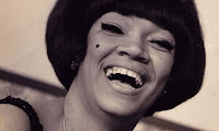
I recently went to the MoMa to watch La Lupe: Queen of Latin Soul; this is a documentary profiling the career of the famous Cuban singer La Lupe. The film takes place in the 1960’s and is primarily in black and white. Since La Lupe primarily sang in Spanish, there are English subtitles in white Helvetica type.
The film was very enjoyable going over the span of Lupe Yoli’s life from domestic abuse, singer, to religious speaker.
The documentary features interviews throughout with people in close relation to La Lupe such as her producer. In these shots the filmmaker chose to use medium close-ups. The use of a medium close up was a strong decision because the shot establishes a location; for example, the producer was set in front of a studio. It allows the audience to connect who the person is to where they are. Sometimes in documentaries people may forget all of the people being introduced. In the film, many pictures are shown as the people are being interviewed. This was a good tactic because the audience will not get bored just watching a person talk for minutes at a time. I loved the use of interview narrations because it allowed audiences to feel closer to Lupe. The movie is an oral history similar to what you find on E!’s Behind the Music.
The film starts with the funeral of La Lupe and backtracks to cover the span of her celebrity. The documentary takes place decades ago but remains present. La Lupe was an innovator and truly ahead of her time.
Sunday, May 9, 2010
Design I like- Stride Gum takes over El Toro
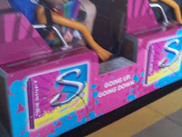
Within the past couple of years the digital age has truly been booming. It has been impossible to avert your eyes from advertisements no matter where you go. Recently I found an advertisement in one of the most unlikely places, a rollercoaster.
The ad was for Stride’s new flavor changing gum and it was located on El Toro in Six Flags Great Adventure in New Jersey. For those unfamiliar with Six Flags rollercoaster, El Toro is a huge wooden coaster and only a couple of years old. Many rollercoaster lovers wait for hours on the line for El Toro making it an interesting place for an ad that is bound to draw many eyes.
The advertisement’s color popped on the otherwise dull light brown colored wood cars. The pinks and blues of the ad filled every alternating car. I really liked the bright colors because they drew my eyes and left me very curious as to what the ad was trying to portray.
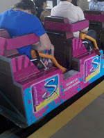
Stride’s new flavor changing gum is supposed to take you on a journey from a fruity to minty flavor. The tagline on the advertisement was in simple white Helvetica text stating “Going Up, Going Down,” very fitting for a rollercoaster that prides itself on hills, spirals, and speed. The simple Helvetica text was not lavish and showed that the main focus of the ad was not on the text. The main focus of the ad was that is was in an unlikely place like El Toro.
The advertisement had a graphic of the gum box. The graphic stuck to the color scheme of the rest of the rollercoaster car with bright blues and pinks but also adding a touch of yellow to add contrast to the gum package. The giant “S” on the graphic represents the logo for stride gum.
I loved the design of the new Stride advertisement. I never saw an advertisement on a rollercoaster and I could not help but think about why a company would chose a rollercoaster. Then I realized that clearly the advertisement worked because it got me thinking.
Sunday, April 18, 2010
What I See- A New Type of Superhero
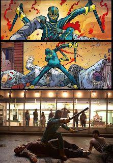
I recently saw the movie Kick-Ass, a story about an everyday high-school student who is in over his head when he decides to dress and act like a superhero. Kick-Ass has its fair share of cliché moments, as far as a superhero movies goes, however the movie has enough unique qualities to stand on its own in the superhero universe.
Since I began taking media classes, I have become increasingly aware of camera angles and how every scene of a movie is carefully crafted into the underlying vision. Kick-Ass is a superhero movie and with that comes back flips, guns, and action, all which is filmed at high speeds and is not particularly easy to shoot. However, I left the theater feeling completely entertained and transfixed by how each stunt was perfectly captured and presented for the audience to understand.
The film opens with a man in a costume standing on top of a skyscraper. Both high angle and low angles shots are used to capture both the man jumping off the building and the onlookers from the street. Within the movie the action is slowed down just enough for the audience to grasp what is going on. As the man jumped off the building he did so with finesse, almost appearing as if he would walk away from the fall unscathed.
At times, the film puts on the façade of being inside a comic book. There were transitions from live-action to a comic book drawing of the same shot. It is with these transitions the audience never forgets the main vision of the film: a comic-book movie.
The film encompasses just about every shot talked about in class, including wide-angle, close-up, long shot, panoramic view, tracking shot, etc. Some of my favorite scenes are when the pint-sized super-heroine took on the “bad guys” twice her size. The camera first establishes the location through a very wide shot focusing on all of the villains as well as the set, and then the camera zooms into a close up on the adolescent hero to establish her emotion in what she is going up against. As the action starts the film fluctuates from high-speed to slow motion, either focusing on a high kick or gunshot.
The movie has the main superhero action plot as well as the back-story of a teen boy trying to find his place. Both stories are handled quirkily and with entirely unorthodox methods. Still, the formula of Kick-Ass is the perfect blend of cliché and unconventional, making the movie a pleasant surprise.
Sunday, March 21, 2010
Jimmy Fallon Experience
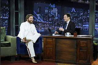
Recently I went to a taping of Late Night with Jimmy Fallon at 30 Rockefeller Plaza. Since I live in Manhattan, a hobby of mine is watch as many television show tapings as possible. Being as I have a growing interest in media and television I figured that going to television tapings would allow me to watch what I have been learning in class first hand. Personally, sometimes I find that everything that goes on behind the scenes is a little more interesting than the show itself.
When I entered the set I was immediately bombarded by huge camera equipment. At times, the audience is completely blocked because of cameras. Some parts of the audience are blind to the entire set; for these areas, flat screen televisions are hanging in different areas of the ceiling. Also, microphones hang from the ceiling recording the laughter and applause that the audience gives in the duration of the taping. The studio is kept at a very low temperature; I read once inEntertainment Weekly that Jimmy Fallon sweats too much so they had to lower the temperature for his tapings.
Jimmy Fallon reads off cue cards as opposed to a teleprompter. During what would be commercial breaks, Fallon studies the cue cards for his next segment. He does not mess up that much so I assume that this method helps.
What was interesting to me is that there is a girl who walks around with a camera taking pictures of the show as it goes on. I later found out that this is what is called a set photographer, someone who takes pictures of all the action but is not directly involved in the taping. The set photographer is used to take pictures for publicity and just overall cataloging of the particular nights show.
Towards end of the show a bunch of people, myself included, were asked to stand behind the band that was performing that night. On the show I went to the band was Silversun Pickups. I stood on the upper right side of the stage, I was not really visible but that did not matter much to me.
I find that I learn better visually that I ever could by reading or studying a textbook. The tapings of these shows are free and give me a chance to watch and learn more about my potential major, media.
Below are some pictures that the set photographer took for the show:
The Museum of Moving Images
The Illusion of Film
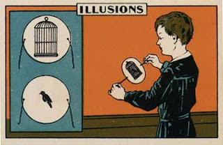
The Museum of Moving Images is a showcase of artifacts and technology that presents an extensive look into the history of media. Throughout my trip to the museum the exhibits that focused on the illusion of film intrigued me. I was excited to see the equipment that led to the development of film. It was fascinating to realize how a thaumatrope, a small disk with a different image drawn on either side, contributed to the birth of cinema and animation. There was also a Zoetrope on display, which is a spinning cylinder with small slits that a viewer looks through and, as the cylinder spins, the pictures come together giving the false impression of one picture. I love how film is not one ongoing stream of video but actually just different pictures being displayed consecutively. The way in which the mind can be so easily manipulated is so fascinating.
Animation like film is just the succession of still images. In the museum there was an exhibit that taught me how to create my own stop-motion animation video; all that was needed was a camera and a few props. Sitting there I slowly created a two second animation, I had to take about twelve photos. I cannot image someone sitting in front of a desk with a camera barley moving props and taking thousands upon thousands of photographs for a feature length film. Even with all the technology America has today, stop-motion animation is still around. Recently, the movie The Fantastic Mr. Fox used stop-motion animation; the film garnered critical acclaim and even an Academy Award nomination.
I learned through the Museum of Moving Images that there is a certain discipline and patience needed in order to be involved in film. The museum is a fascinating place for beginners of the media field and experts alike.
